【R】地図を描いてみる(tmap編)
2020年4月28日
tmapというパッケージあり、柔軟に地図を描けそうなので、試してみた。
こちらの「Intro to GIS and Spatial Analysis」というレクチャー用資料を参考にしました。
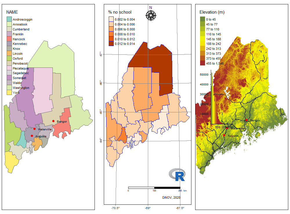
3つの地図を描きます。最初は町名、2番目は学校数、最後は高低差と鉄道網です。
library(tmap)

a<-load(url("http://github.com/mgimond/Spatial/raw/master/Data/Sample1.RData")) # データ読込

# 町名マップ
map.name<-tm_shape(s.sf) +
    tm_polygons("NAME", palette = "Set3") +
    tm_legend(outside = FALSE)+
  tm_shape(p.sf) +    # 都市表示
    tm_dots(size=  .3, col = "red") +
    tm_text("Name", just = "left", xmod = 0.5, size = 0.6)

# 統計マップ(学校数)
map.noschool<-tm_shape(s.sf) +
    tm_polygons(col="NoSchool", border.col = "blue", palette="Oranges", title = "% no school") +
    tm_layout(outer.margins = c(.1,.1,.1,.1)) +
    tm_grid(labels.inside.frame = FALSE, # グリッドを表示、緯度・経度をつける
          x =  c(-70.5, -69, -67.5) ,
          y = c(44, 45, 46, 47),
          projection = "+proj=longlat",
          labels.rot = c(0, 90),
          labels.format = list(fun=function(x) {paste0(x,intToUtf8(176))} ) ) +
    tm_compass(position = c("LEFT", "TOP"), type = "rose", size = 2) + # コンパスの絵(方位表示)
    tm_logo("https://www.r-project.org/logo/Rlogo.png", height=2) + # ”R”のロゴを表示
    tm_scale_bar(breaks = c(0, 100, 200), size = 0.5) + # 距離表示のバー
    tm_credits("DiNOV, 2020")

# 高低差マップ
map.elev<-tm_shape(elev.r) +
    tm_raster(style = "quantile", n = 10, title = "Elevation (m)",
          palette = colorRampPalette( c("darkolivegreen4","yellow", "brown"))(10),
          legend.hist = TRUE,
          legend.is.portrait = TRUE)+
    tm_legend(outside = FALSE, hist.width = 2, position=c("left", "top"))+
  tm_shape(rail.sf) + tm_lines(col="black") + # 鉄道網を表示
  tm_shape(p.sf) + tm_dots(size=.3, col="red") + # 都市表示
    tm_text("Name", just = "left", xmod = 0.5, size = 0.6)

tmap_arrange(map.name, map.noschool, map.elev)
実行すると、このように表示されます。すごい!