【R】Random Forest (Datasaurus)
2020年10月19日
1. はじめに
TidyTuesdayのお題になったDatasaurusのデータセットで、どういうデータが機械学習しにくいかを見てみます。
Juila SilgeさんのYouTubeビデオで勉強しました。
2. やってみる
2.1 データ
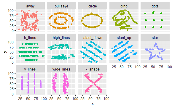
データは、TidyTuesdayのお題であるデータセットでDatasaurusです。これは、13個の(x,y)データセットがあり、すべてのデータは、個数(142個)、平均、標準偏差が一致しているのですが、XYプロットすると全く異なる図形を描くというものです。
人間が目視すると簡単に各データを区別できますが、これを計算器に入れると難しいことは容易にわかります。どういうデータが判別しにくいかを検証してみます。
library(tidyverse)
library(datasauRus)

datasaurus_dozen
> datasaurus_dozen
# A tibble: 1,846 x 3
   dataset     x     y
   <chr>   <dbl> <dbl>
 1 dino     55.4  97.2
 2 dino     51.5  96.0
 3 dino     46.2  94.5
 4 dino     42.8  91.4
 5 dino     40.8  88.3
 6 dino     38.7  84.9
 7 dino     35.6  79.9
 8 dino     33.1  77.6
 9 dino     29.0  74.5
10 dino     26.2  71.4
# ... with 1,836 more rows
プロットしてみると次のようになります。
datasaurus_dozen %>%
  ggplot(aes(x, y, color=dataset)) +
  geom_point(alpha=0.8, show.legend = FALSE) +
  facet_wrap(~dataset, ncol=5)
各データセットの平均、標準偏差を見てみると。
datasaurus_dozen %>%
  group_by(dataset) %>%
  summarise(across(c(x, y), list(mean = mean, sd = sd)))
`summarise()` ungrouping output (override with `.groups` argument)
# A tibble: 13 x 5
   dataset    x_mean  x_sd y_mean  y_sd
   <chr>       <dbl> <dbl>  <dbl> <dbl>
 1 away         54.3  16.8   47.8  26.9
 2 bullseye     54.3  16.8   47.8  26.9
 3 circle       54.3  16.8   47.8  26.9
 4 dino         54.3  16.8   47.8  26.9
 5 dots         54.3  16.8   47.8  26.9
 6 h_lines      54.3  16.8   47.8  26.9
 7 high_lines   54.3  16.8   47.8  26.9
 8 slant_down   54.3  16.8   47.8  26.9
 9 slant_up     54.3  16.8   47.8  26.9
10 star         54.3  16.8   47.8  26.9
11 v_lines      54.3  16.8   47.8  26.9
12 wide_lines   54.3  16.8   47.8  26.9
13 x_shape      54.3  16.8   47.8  26.9
このように、きれいに一致しています。
ただし、相関係数は、次のように異なります。
datasaurus_dozen %>%
  group_by(dataset) %>%
  summarise(across(c(x, y), list(mean = mean, sd = sd)), x_y_col = cor(x, y))
`summarise()` ungrouping output (override with `.groups` argument)
# A tibble: 13 x 6
   dataset    x_mean  x_sd y_mean  y_sd x_y_col
   <chr>       <dbl> <dbl>  <dbl> <dbl>   <dbl>
 1 away         54.3  16.8   47.8  26.9 -0.0641
 2 bullseye     54.3  16.8   47.8  26.9 -0.0686
 3 circle       54.3  16.8   47.8  26.9 -0.0683
 4 dino         54.3  16.8   47.8  26.9 -0.0645
 5 dots         54.3  16.8   47.8  26.9 -0.0603
 6 h_lines      54.3  16.8   47.8  26.9 -0.0617
 7 high_lines   54.3  16.8   47.8  26.9 -0.0685
 8 slant_down   54.3  16.8   47.8  26.9 -0.0690
 9 slant_up     54.3  16.8   47.8  26.9 -0.0686
10 star         54.3  16.8   47.8  26.9 -0.0630
11 v_lines      54.3  16.8   47.8  26.9 -0.0694
12 wide_lines   54.3  16.8   47.8  26.9 -0.0666
13 x_shape      54.3  16.8   47.8  26.9 -0.0656
これらのデータを機械学習でただしく推測できるかみてみます。
2.2 モデル
モデルを作っていきます。データのdatasetが正解でこれをfactorにしておきます。
library(tidymodels)

dino_folds <- datasaurus_dozen %>%
  mutate(dataset = factor(dataset)) %>%
  bootstraps()

dino_folds
 dino_folds
# Bootstrap sampling
# A tibble: 25 x 2
   splits             id
   <list>             <chr>
 1 <split [1.8K/692]> Bootstrap01
 2 <split [1.8K/673]> Bootstrap02
 3 <split [1.8K/668]> Bootstrap03
 4 <split [1.8K/676]> Bootstrap04
 5 <split [1.8K/656]> Bootstrap05
 6 <split [1.8K/687]> Bootstrap06
 7 <split [1.8K/677]> Bootstrap07
 8 <split [1.8K/680]> Bootstrap08
 9 <split [1.8K/679]> Bootstrap09
10 <split [1.8K/692]> Bootstrap10
# ... with 15 more rows
ランダムフォレストを使い、分類します。ワークフローを作っておきます。
rf_spec <- rand_forest(trees = 1000) %>%
  set_mode("classification") %>%
  set_engine("ranger")

dino_wf <- workflow() %>%
  add_model(rf_spec) %>%
  add_formula(dataset ~ x + y)

dino_wf
```
> dino_wf
== Workflow ====================================================================
Preprocessor: Formula
Model: rand_forest()

-- Preprocessor ----------------------------------------------------------------
dataset ~ x + y

-- Model -----------------------------------------------------------------------
Random Forest Model Specification (classification)

Main Arguments:
  trees = 1000

Computational engine: ranger
2.3 学習
できたモデルを学習します。学習を早めるために並列処理します。
doParallel::registerDoParallel()
dino_rs <- fit_resamples(
  dino_wf,
  resamples = dino_folds,
  control = control_resamples(save_pred = TRUE)
)

dino_rs
> dino_rs
# Resampling results
# Bootstrap sampling
# A tibble: 25 x 5
   splits             id          .metrics         .notes           .predictions
   <list>             <chr>       <list>           <list>           <list>
 1 <split [1.8K/692]> Bootstrap01 <tibble [2 x 3]> <tibble [0 x 1]> <tibble [692 x 16]>
 2 <split [1.8K/673]> Bootstrap02 <tibble [2 x 3]> <tibble [0 x 1]> <tibble [673 x 16]>
 3 <split [1.8K/668]> Bootstrap03 <tibble [2 x 3]> <tibble [0 x 1]> <tibble [668 x 16]>
 4 <split [1.8K/676]> Bootstrap04 <tibble [2 x 3]> <tibble [0 x 1]> <tibble [676 x 16]>
 5 <split [1.8K/656]> Bootstrap05 <tibble [2 x 3]> <tibble [0 x 1]> <tibble [656 x 16]>
 6 <split [1.8K/687]> Bootstrap06 <tibble [2 x 3]> <tibble [0 x 1]> <tibble [687 x 16]>
 7 <split [1.8K/677]> Bootstrap07 <tibble [2 x 3]> <tibble [0 x 1]> <tibble [677 x 16]>
 8 <split [1.8K/680]> Bootstrap08 <tibble [2 x 3]> <tibble [0 x 1]> <tibble [680 x 16]>
 9 <split [1.8K/679]> Bootstrap09 <tibble [2 x 3]> <tibble [0 x 1]> <tibble [679 x 16]>
10 <split [1.8K/692]> Bootstrap10 <tibble [2 x 3]> <tibble [0 x 1]> <tibble [692 x 16]>
# ... with 15 more rows
2.4 評価
評価してみます。
collect_metrics(dino_rs)
> collect_metrics(dino_rs)
# A tibble: 2 x 5
  .metric  .estimator  mean     n std_err
  <chr>    <chr>      <dbl> <int>   <dbl>
1 accuracy multiclass 0.447    25 0.00355
2 roc_auc  hand_till  0.844    25 0.00128
accuracyが0.447とあまりよくありません。
dino_rs %>%
  collect_predictions()
# A tibble: 16,997 x 17
   id    .pred_away .pred_bullseye .pred_circle .pred_dino .pred_dots .pred_h_lines
   <chr>      <dbl>          <dbl>        <dbl>      <dbl>      <dbl>         <dbl>
 1 Boot~   0.153           0.0247       0.00538    0.0956    0.0696         0.110
 2 Boot~   0.0561          0.0235       0.00215    0.0458    0.00914        0.0741
 3 Boot~   0.193           0.114        0.0147     0.00858   0.00875        0.00252
 4 Boot~   0.0797          0.193        0.0460     0.00253   0.000143       0.00734
 5 Boot~   0.0306          0.0522       0.123      0.00267   0              0.0283
 6 Boot~   0.000525        0.363        0.241      0.103     0.00137        0.0548
 7 Boot~   0.0532          0.0642       0.0782     0.189     0.00178        0.0629
 8 Boot~   0.00141         0.00297      0.227      0.118     0.395          0.166
 9 Boot~   0.0297          0.0276       0.0137     0.296     0.0681         0.0697
10 Boot~   0.0342          0.239        0.00371    0.0807    0.112          0.114
# ... with 16,987 more rows, and 10 more variables: .pred_high_lines <dbl>,
#   .pred_slant_down <dbl>, .pred_slant_up <dbl>, .pred_star <dbl>, .pred_v_lines <dbl>,
#   .pred_wide_lines <dbl>, .pred_x_shape <dbl>, .row <int>, .pred_class <fct>,
#   dataset <fct>
dino_rs %>% collect_predictions() %>% ppv(dataset, .pred_class) #positive predictive value
# A tibble: 1 x 3
  .metric .estimator .estimate
  <chr>   <chr>          <dbl>
1 ppv     macro          0.423
dino_rs %>% collect_predictions() %>% group_by(id) %>% ppv(dataset, .pred_class)
# A tibble: 25 x 4
   id          .metric .estimator .estimate
   <chr>       <chr>   <chr>          <dbl>
 1 Bootstrap01 ppv     macro          0.430
 2 Bootstrap02 ppv     macro          0.444
 3 Bootstrap03 ppv     macro          0.389
 4 Bootstrap04 ppv     macro          0.428
 5 Bootstrap05 ppv     macro          0.421
 6 Bootstrap06 ppv     macro          0.396
 7 Bootstrap07 ppv     macro          0.434
 8 Bootstrap08 ppv     macro          0.443
 9 Bootstrap09 ppv     macro          0.444
10 Bootstrap10 ppv     macro          0.437
# ... with 15 more rows
ROCカーブを描いてみます。
dino_rs %>%
  collect_predictions() %>%
  group_by(id) %>%
  roc_curve(dataset,  .pred_away : .pred_x_shape) %>%
  autoplot()
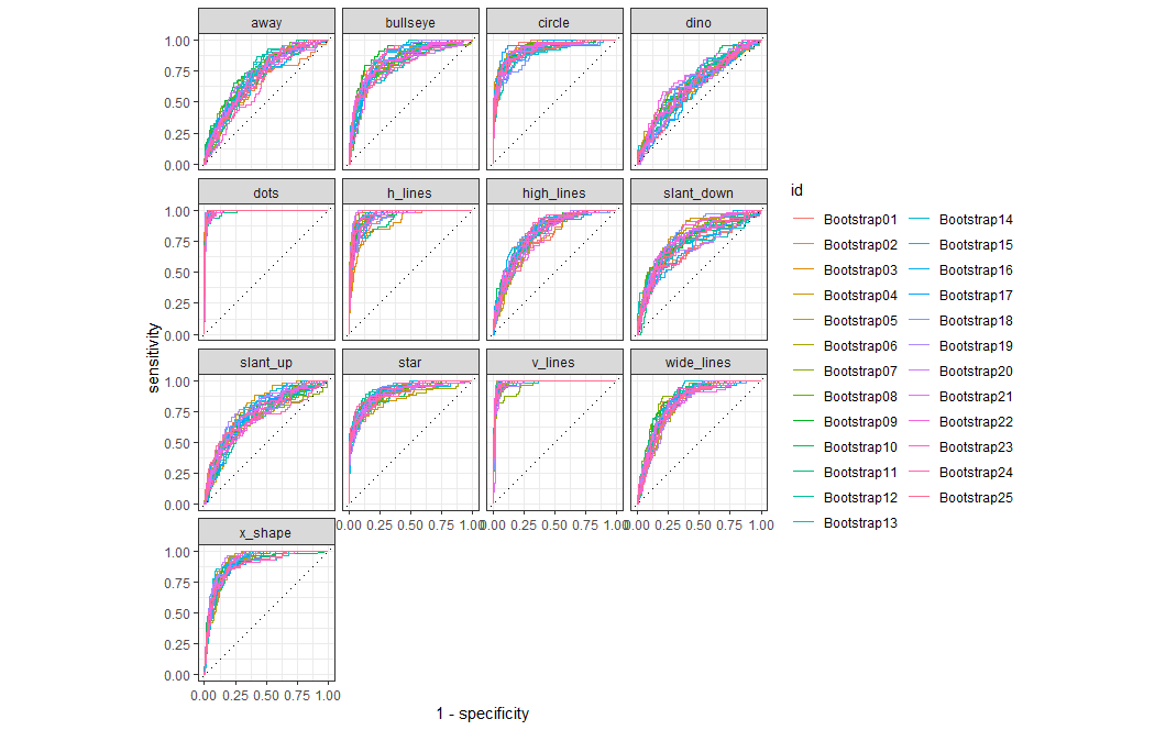
dotやy_lineは容易に推測できていますが、dinoは難しそうです。
heatmapで見てみます。
dino_rs %>%
  collect_predictions() %>%
  conf_mat(dataset, .pred_class) %>%
  autoplot(type="heatmap")
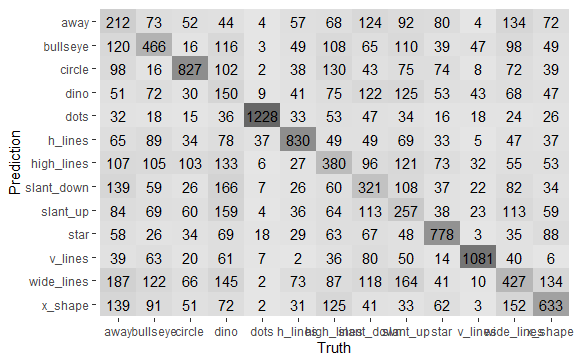
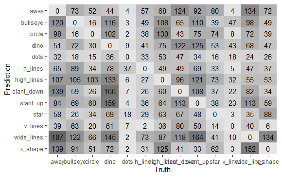
色の濃淡からも得手不得手が見て取れます。最後に、正解以外を詳しくみてみます。
dino_rs %>%
  collect_predictions() %>%
  filter(.pred_class != dataset) %>%
  conf_mat(dataset, .pred_class) %>%
  autoplot(type="heatmap")
3. 最後に
人では容易に区別できるデータセットも、機械学習では難しいことの例でした。