【R】世界の平均余命の変遷
2020年5月12日
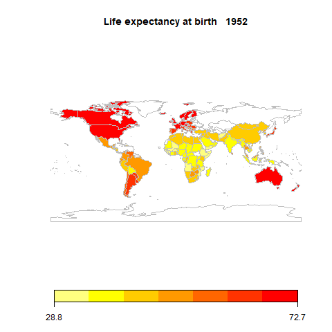
RのGapminderというパッケージに、life expectancy at birth、total population、per-capita GDPの世界国々の1952~2007年まで5年毎のデータが集められています。
世界地図を使って、この平均余命の変遷をアニメーションで表示してみたいと思います。
結果がこちら。特にアフリカの平均余命が年を追うごとに良くなっているのがわかります。
コードはこちら。
library(rworldmap)
library(gapminder)
library(animation)

dat<-gapminder

years<-unique(dat$year)

ani.options(outdir=getwd(), convert = 'C:/Program Files/ImageMagick-7.0.10-Q16/convert.exe')

replot <- function(n){

  for(i in years){

    ret<-dat[dat$year==i,]
    lexp <- joinCountryData2Map(ret, joinCode="NAME", nameJoinColumn="country")
    mapCountryData(lexp, nameColumnToPlot="lifeExp", catMethod="fixedWidth", mapTitle = paste("Life expectancy at birth  ", i), addLegend = TRUE)

  }

}

saveGIF({replot(length(f_year)-2)}, clean=TRUE, img.name="LifeExp_World", movie.name="LifeExp_World.gif")