【R】インタラクティブ3Dプロット
2020年5月25日
Rのパッケージで、インタラクティブな3Dプロットを行えるthreejsというものがあります。knitやshinyとも連携できるので、かなり使い勝手がいいです。WebGLのThree.jsをRに移植したものと思われます。
次の例がありました。
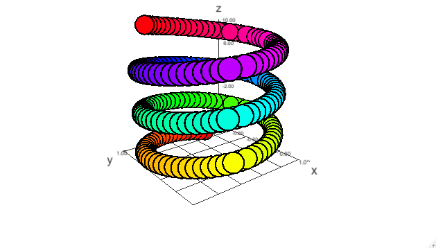
# Example 1 from the scatterplot3d package (cf.)
z <- seq(-10, 10, 0.1)
x <- cos(z)
y <- sin(z)
scatterplot3js(x, y, z, color=rainbow(length(z)))
# Same example with explicit axis labels
scatterplot3js(x, y, z, color=rainbow(length(z)), axisLabels=c("a", "b", "c"))
# Same example showing multiple point styles with pch
scatterplot3js(x, y, z, color=rainbow(length(z)),
pch=sample(c(".", "o", letters), length(x), replace=TRUE))
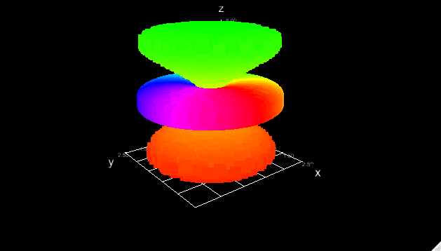
# Point cloud example, should run this with WebGL!
N <- 20000
theta <- runif (N) * 2 * pi
phi <- runif (N) * 2 * pi
R <- 1.5
r <- 1.0
x <- (R + r * cos(theta)) * cos(phi)
y <- (R + r * cos(theta)) * sin(phi)
z <- r * sin(theta)
d <- 6
h <- 6
t <- 2 * runif (N) - 1
w <- t^2 * sqrt(1 - t^2)
x1 <- d * cos(theta) * sin(phi) * w
y1 <- d * sin(theta) * sin(phi) * w
i <- order(phi)
j <- order(t)
col <- c( rainbow(length(phi))[order(i)],
rainbow(length(t), start=0, end=2/6)[order(j)])
M <- cbind(x=c(x, x1), y=c(y, y1), z=c(z, h*t))
scatterplot3js(M, size=0.5, color=col, bg="black", pch=".")
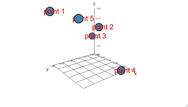
# Plot generic text using 'pch' (we label some points in this example)
set.seed(1)
x <- rnorm(5); y <- rnorm(5); z <- rnorm(5)
scatterplot3js(x, y, z, pch="@") %>%
points3d(x + 0.1, y + 0.1, z, color="red", pch=paste("point", 1:5))

拡大・縮小ができ、マウスでグリグリ回せるので、面白いです。
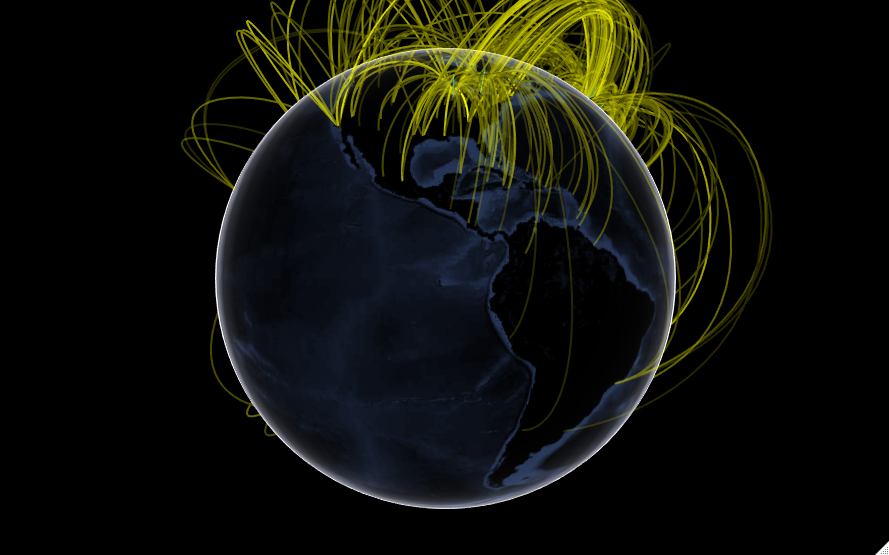
また、地球上の飛行機のフライトの様子を表す例もあります。
library(threejs)
# Plot flights to frequent destinations from Callum Prentice's
# global flight data set,
# http://callumprentice.github.io/apps/flight_stream/index.html
data(flights)
# Approximate locations as factors
dest <- factor(sprintf("%.2f:%.2f",flights[,3], flights[,4]))
# A table of destination frequencies
freq <- sort(table(dest), decreasing=TRUE)
# The most frequent destinations in these data, possibly hub airports?
frequent_destinations <- names(freq)[1:10]
# Subset the flight data by destination frequency
idx <- dest %in% frequent_destinations
frequent_flights <- flights[idx, ]
# Lat/long and counts of frequent flights
ll <- unique(frequent_flights[,3:4])
# Plot frequent destinations as bars, and the flights to and from
# them as arcs. Adjust arc width and color by frequency.
globejs(img = system.file("images/world.jpg", package = "threejs"), lat=ll[, 1], long=ll[, 2], arcs=frequent_flights,
        bodycolor="#aaaaff", arcsHeight=0.3, arcsLwd=2,
        arcsColor="#ffff00", arcsOpacity=0.15,
        atmosphere=TRUE, color="#00aaff", pointsize=0.5)
## Not run:
こちらも非常に面白いです。