【R】treemapify
2020年8月28日
1. はじめに
treemapifyは、treemapsを描くggplot2 geomsを提供してくれるパッケージです。
2. インストール
CRANからインストールします。
install.packages("treemapify")3. 使ってみる
このパッケージにはG20の国々の統計データが含まれています。それを使って、treemapsを描いてみます。まずは、最も基本的なものから。
library(ggplot2)
library(treemapify)
head(G20)

ggplot(G20, aes(area = gdp_mil_usd, fill = hdi)) +
  geom_treemap()
> head(G20)
         region       country gdp_mil_usd   hdi econ_classification hemisphere
1        Africa  South Africa      384315 0.629          Developing   Southern
2 North America United States    15684750 0.937            Advanced   Northern
3 North America        Canada     1819081 0.911            Advanced   Northern
4 North America        Mexico     1177116 0.775          Developing   Northern
5 South America        Brazil     2395968 0.730          Developing   Southern
6 South America     Argentina      474954 0.811          Developing   Southern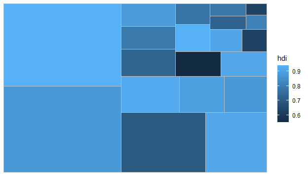
タイルの大きさはGDPの大きさ、色はHDI (Human Development Index)を表しています。国名が入っていないとわかりませんね。。。
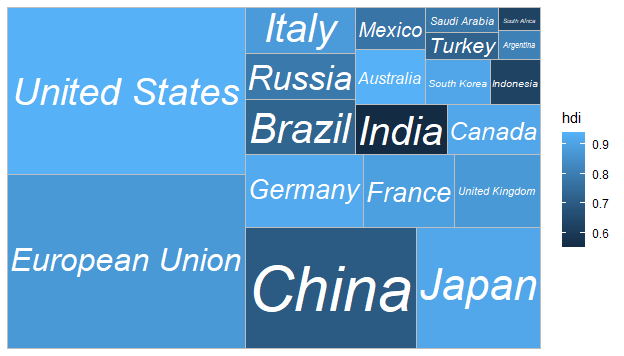
そこで、国名を入れたのがこちら。
ggplot(G20, aes(area = gdp_mil_usd, fill = hdi, label = country)) +
  geom_treemap() +
  geom_treemap_text(fontface = "italic", colour = "white", place = "centre",
                    grow = TRUE)
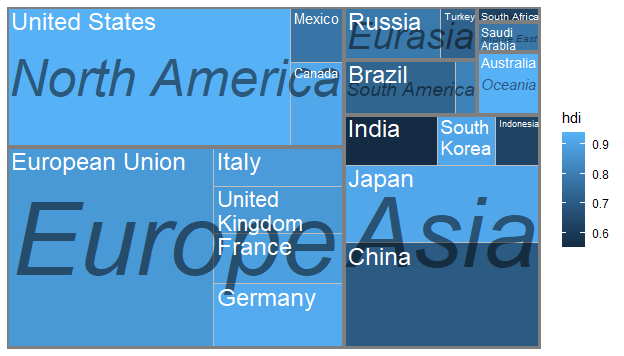
地域ごとに分けて、表示します。
ggplot(G20, aes(area = gdp_mil_usd, fill = hdi, label = country,
                subgroup = region)) +
  geom_treemap() +
  geom_treemap_subgroup_border() +
  geom_treemap_subgroup_text(place = "centre", grow = T, alpha = 0.5, colour =
                               "black", fontface = "italic", min.size = 0) +
  geom_treemap_text(colour = "white", place = "topleft", reflow = T)
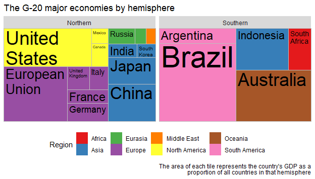
北半球と南半球で分けて、地域ごとに色分けします。
ggplot(G20, aes(area = gdp_mil_usd, fill = region, label = country, subgroup = region)) +
  geom_treemap() +
  geom_treemap_text(grow = T, reflow = T, colour = "black") +
  facet_wrap( ~ hemisphere) +
  scale_fill_brewer(palette = "Set1") +
  theme(legend.position = "bottom") +
  labs(
    title = "The G-20 major economies by hemisphere",
    caption = "The area of each tile represents the country's GDP as a
      proportion of all countries in that hemisphere",
    fill = "Region"
  )
4. さいごに
簡単に表示できますね。まだ、どんなデータを表示したらよいのか良案が思いつきませんが、いつか役立つときが来るでしょう。