【R】popcircle
2021年1月9日
1. はじめに
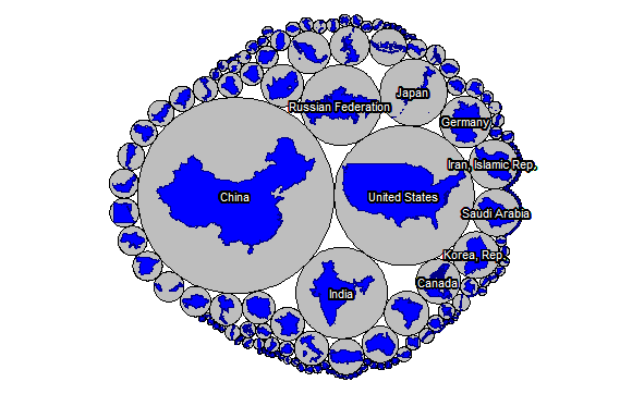
popcircleは、ある変数の大きさに比例した円を描画してくれ、それらをコンパクトに表示してくれるパッケージです。CO2の排出量(百万トン)の地図を描いてみます。
2. インストール
Githubからインストールします。
remotes::install_github("rCarto/popcircle")3. 使ってみる
とりあえず、例を参考に地図を描いてみます。上位10か国は、国名をいれます。
library(rnaturalearth)
library(sf)
library(wbstats)
library(popcircle)

ctry <- ne_countries(scale = 50, returnclass = "sf")
ctry <- st_transform(ctry, 3857)

frag_ctry <- c("US", "RU", "FR", "IN", "ES", "NL", "CL", "NZ", "ZA", "AU", "KR")
largest_ring = function(x) {
  x$ids <- 1:nrow(x)
  pols = st_cast(x, "POLYGON", warn = FALSE)
  spl = split(x = pols, f = pols$ids)
  do.call(rbind, (lapply(spl, function(y) y[which.max(st_area(y)),])))
}
st_geometry(ctry[ctry$iso_a2 %in% frag_ctry,]) <-
  st_geometry(largest_ring(ctry[ctry$iso_a2 %in% frag_ctry,]))

data_co2 <- wb(indicator = "EN.ATM.CO2E.KT", startdate = 2014, enddate = 2014)
ctry_co2 <- merge(ctry[,"iso_a2"], data_co2, by.x = "iso_a2", by.y = "iso2c" )

res_co2 <- popcircle(x = ctry_co2, var = "value")
circles_co2 <- res_co2$circles
shapes_co2 <- res_co2$shapes
shapes_co2 <- st_transform(shapes_co2, 4326)
circles_co2 <- st_transform(circles_co2, 4326)

par(mar = c(0,0,0,0))
plot(st_geometry(circles_co2), col = "gray", border = "black")
plot(st_geometry(shapes_co2), col = "blue", add = TRUE, lwd = 1, border = "blue4")
if(require(cartography)){
  labelLayer(x = circles_co2[1:10,], txt = "country", halo = TRUE, overlap = FALSE,
             col ="white", bg = "black", r = .15)
}
4. さいごに
このような地図も面白いですね。