【R】ggplot2でキレイな図を
2021年2月8日
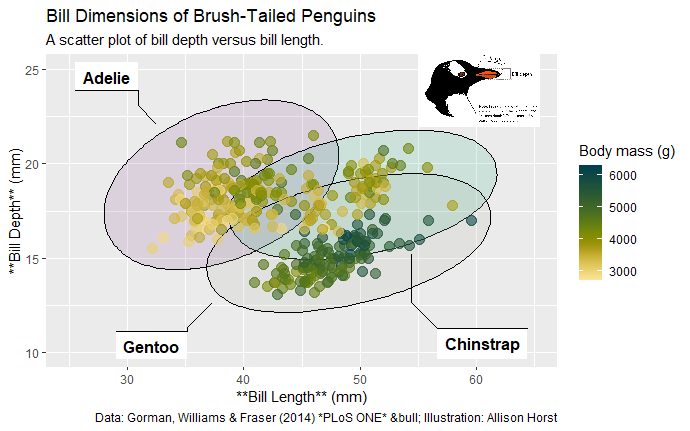
ggplot Wizardry Hands-Onでキレイな図の書き方が紹介されていたのでやってみた。
データは、ペンギンのデータ。
library(tidyverse)
library(systemfonts)
library(scico)
library(ggforce)


penguins <-
  readr::read_csv('https://raw.githubusercontent.com/rfordatascience/tidytuesday/master/data/2020/2020-07-28/penguins.csv') %>%
  mutate(species = if_else(species == "Adelie", "Adélie", species)) %>%
  filter(!is.na(bill_length_mm), !is.na(bill_depth_mm))

png <- magick::image_read("https://raw.githubusercontent.com/allisonhorst/palmerpenguins/master/man/figures/culmen_depth.png")
img <- grid::rasterGrob(png, interpolate = TRUE)


ggplot(penguins, aes(x = bill_length_mm, y = bill_depth_mm)) +
  scico::scale_color_scico(palette = "bamako", direction = -1) +
  coord_cartesian(xlim = c(25, 65), ylim = c(10, 25)) +
  rcartocolor::scale_fill_carto_d(palette = "Bold") +
  labs(
    title = "Bill Dimensions of Brush-Tailed Penguins",
    subtitle = 'A scatter plot of bill depth versus bill length.',
    caption = "Data: Gorman, Williams & Fraser (2014) *PLoS ONE*",
    x = "**Bill Length** (mm)",
    y = "**Bill Depth** (mm)",
    color = "Body mass (g)",
    fill = "Species"
  ) +
  ggforce::geom_mark_ellipse(
    aes(fill = species, label = species),
    alpha = .15, show.legend = FALSE
  ) +
  geom_point(aes(color = body_mass_g), alpha = .6, size = 3.5)+
  annotation_custom(img, ymin = 19.5, ymax = 28.5, xmin = 55, xmax = 65.5) +
    labs(caption = "Data: Gorman, Williams & Fraser (2014) *PLoS ONE* • Illustration: Allison Horst")