【R】ggplotでpie chart
2021年6月30日
ggplotを利用してpie chartをいろいろ描いてみます。
基本的には、棒グラフを描いて、coord_polar(theta = "y")だけです。しかし、工夫することで、ちょっと見栄えの異なるチャートができます。
こちらを参考にしました。
まずは、単純な例で。
library(tidyverse)

diamonds_col <- diamonds %>%
  group_by(color) %>%
  summarise(N = n()) %>%
  mutate(col = as.factor(color))

ggplot(diamonds_col, aes(x = "x", y = N, fill = color)) +
  geom_bar(stat = "identity", position = "stack") +
  coord_polar(theta = "y")
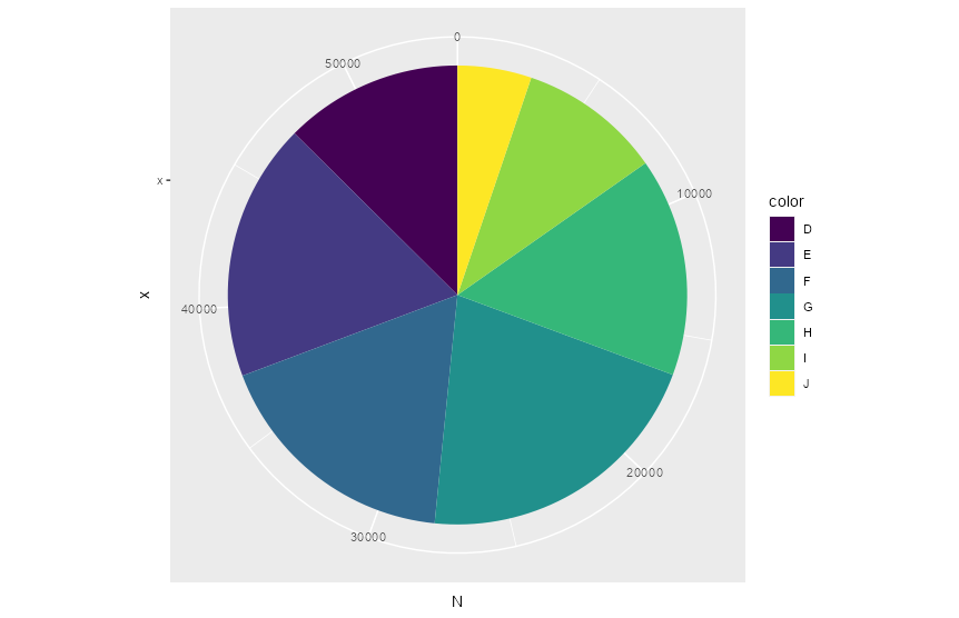
ここでcoord_polar(theta = "y", direction = -1)とすると、逆向きになります。
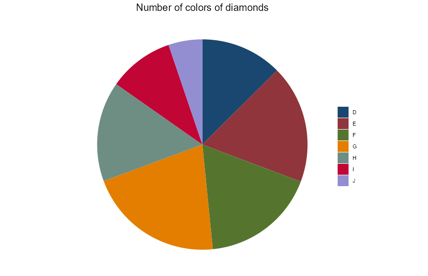
不要な文字を消したり、色を変更したりします。
library(ggthemes)

ggplot(diamonds_col, aes(x = "x", y = N, fill = color)) +
  geom_bar(stat = "identity", position = "stack") +
  coord_polar(theta = "y", direction = -1) +
  labs(title = "Number of colors of diamonds") +
  theme_void() +
  scale_color_stata() +
  scale_fill_stata(scheme = "s2color", name = NULL)+
  theme(plot.title = element_text(hjust = 0.5, size = 15))
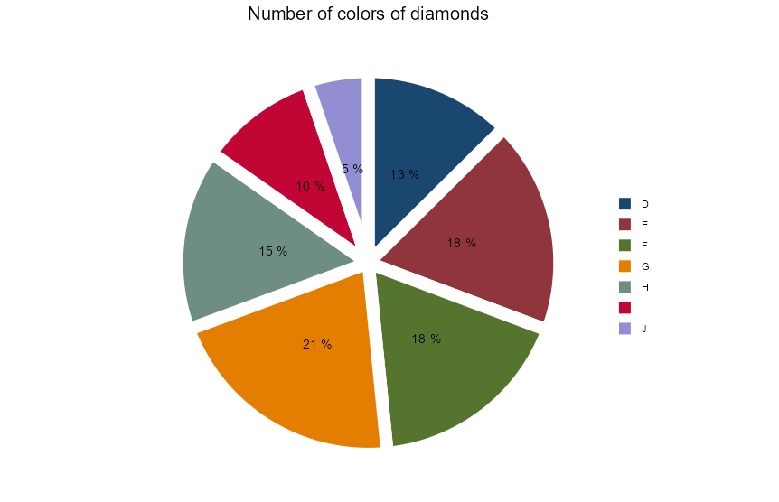
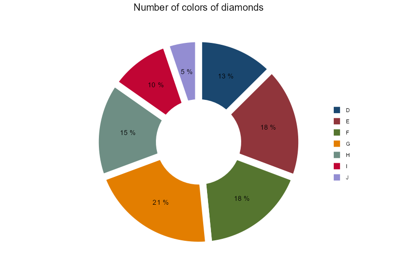
各値の割合を表示させます。さらに、パイを切り離してみますj。
label_col <- diamonds_col %>%
  arrange(desc(col)) %>%
  mutate(cumsum = cumsum(N),
         mid = N/2,
         pos = cumsum - mid,
         prop = paste(100*round(N/sum(N), 2), "%"))

ggplot(diamonds_col, aes(x = "x", y = N, fill = col)) +
  geom_bar(stat = "identity", position = "stack", color = "white", size = 5) +
  geom_text(data = label_col, aes(x = "x", y = pos, label = prop)) +
  coord_polar(theta = "y", direction = -1, clip = "off") +
  labs(title = "Number of colors of diamonds") +
  theme_void() +
  scale_color_stata() +
  scale_fill_stata(scheme = "s2color", name = NULL)+
  theme(plot.title = element_text(hjust = 0.5, size = 15))
さらに、scale_x_discrete(limits = c("x_empty", "x")) + をつけると真ん中が抜けたドーナツチャートになります。
ggplot(diamonds_col, aes(x = "x", y = N, fill = col)) +
  geom_bar(stat = "identity", position = "stack", color = "white", size = 5) +
  scale_x_discrete(limits = c("x_empty", "x")) +
  geom_text(data = label_col, aes(x = "x", y = pos, label = prop)) +
  coord_polar(theta = "y", direction = -1, clip = "off") +
  labs(title = "Number of colors of diamonds") +
  theme_void() +
  scale_color_stata() +
  scale_fill_stata(scheme = "s2color", name = NULL)+
  theme(plot.title = element_text(hjust = 0.5, size = 15))
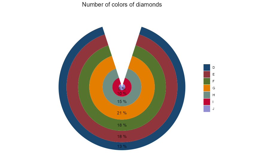
coord_polar()にて theta=”Y” の代わりに theta=”X” とするとBull’s eveチャートにできます。
ggplot(diamonds_col, aes(x = "x", y = N, fill = col)) +
  geom_bar(stat = "identity", position = "stack") +
  geom_text(data = label_col, aes(x = "x", y = pos, label = prop)) +
  coord_polar(theta = "x", direction = -1, clip = "off") +
  labs(title = "Number of colors of diamonds") +
  theme_void() +
  scale_color_stata() +
  scale_fill_stata(scheme = "s2color", name = NULL)+
  theme(plot.title = element_text(hjust = 0.5, size = 15))