【R】ggplotでimageを使う
2020年10月19日
ggplotでイメージ画像を使う方法の一つにggimageパッケージの利用があります。ここでは、Plotting Points as Images in ggplotというThomas Mock氏のpostを実際にやってみました。
データは、espnscrapeRという同氏のパッケージにてスクレイピングしてとってきます。これは、NFLのQBRのデータをESPNのサイトから取得するものです。僕は、NFLは全く興味がないので、わかりませんが。。。
まずは、パッケージのインストールです。Githubからインストールします。
remotes::install_github("jthomasmock/espnscrapeR")まずは、データを取得・クリーニング後に、普通にggplotで表示します。
library(ggplot2)
library(ggtext)
library(ggimage)
library(tidyverse)
library(gt)
library(espnscrapeR)
# Get QBR data
qbr_data <- espnscrapeR::get_nfl_qbr(2020)
# Get NFL team data
team_data <- espnscrapeR::get_nfl_teams()
all_data <- qbr_data %>%
left_join(team_data, by = c("team" = "team_short_name"))
link_to_img <- function(x, width = 50) {
glue::glue("<img src='{x}' width='{width}'/>")
}
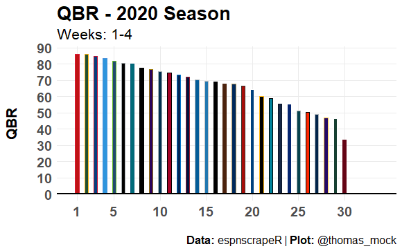
basic_plot <- all_data %>%
mutate(label = link_to_img(headshot_href),
rank = as.integer(rank)) %>%
ggplot() +
geom_col(
aes(
x = rank, y = qbr_total,
fill = team_color, color = alternate_color
),
width = 0.4
) +
scale_color_identity(aesthetics = c("fill", "color")) +
geom_hline(yintercept = 0, color = "black", size = 1) +
theme_minimal() +
scale_x_continuous(breaks = c(1, seq(5, 30, by = 5)), limits = c(0.5, 34)) +
scale_y_continuous(breaks = scales::pretty_breaks(n = 10)) +
labs(x = NULL,
y = "QBR\n",
title = "QBR - 2020 Season",
subtitle = "Weeks: 1-4",
caption = "<br>**Data:** espnscrapeR | **Plot:** @thomas_mock") +
theme(
text = element_text(family = "Chivo"),
panel.grid.minor = element_blank(),
plot.title = element_text(face = "bold", size = 20),
plot.subtitle = element_text(size = 16),
plot.caption = element_markdown(size = 12),
axis.text = element_text(size = 14, face = "bold"),
axis.title.y = element_text(size = 16, face = "bold")
)
basic_plot
選手の画像を入れるには、次のようにします。
qb_col_img <- basic_plot +
  geom_image(
    aes(
      x = rank, y = qbr_total,
      image = headshot_href
    )
  )
qb_col_img
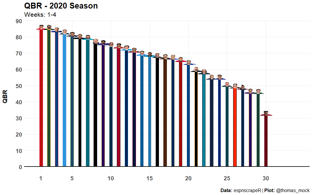
選手の画像が表示されましたが、ちょっとつぶれています。画像のアスペクト比を調整します。
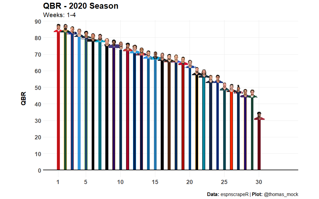
今度は、良くなりました。
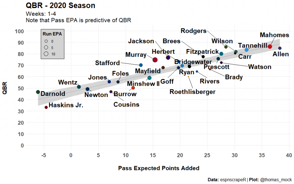
散布図を描いてみます。
library(ggrepel)

scatter_plot <- all_data %>%
  mutate(label = link_to_img(headshot_href),
         rank = as.integer(rank)) %>%
  ggplot() +
  geom_smooth(aes(x = pass, y = qbr_total), method = "lm", color = "grey") +
  ggrepel::geom_text_repel(
    aes(x = pass, y = qbr_total, label = last_name),
    box.padding = 0.5, fontface = "bold", size = 6
  ) +
  geom_point(
    aes(x = pass, y = qbr_total, size = run, fill = team_color, color = alternate_color),
    shape = 21
  ) +
  scale_color_identity(aesthetics =  c("fill", "color")) +
  scale_size(name = "Run EPA") +
  theme_minimal() +
  scale_x_continuous(breaks = scales::pretty_breaks(n = 10)) +
  scale_y_continuous(breaks = scales::pretty_breaks(n = 10), limits = c(0, 100)) +
  labs(x = "\nPass Expected Points Added",
       y = "QBR\n",
       title = "QBR - 2020 Season",
       subtitle = "Weeks: 1-4\nNote that Pass EPA is predictive of QBR",
       caption = "<br>**Data:** espnscrapeR | **Plot:** @thomas_mock") +
  theme(
    text = element_text(family = "Chivo"),
    panel.grid.minor = element_blank(),
    plot.title = element_text(face = "bold", size = 20),
    plot.subtitle = element_text(size = 16),
    plot.caption = element_markdown(size = 12),
    axis.text = element_text(size = 14, face = "bold"),
    axis.title = element_text(size = 16, face = "bold"),
    legend.position = c(0.1,0.85),
    legend.background = element_rect(fill = "lightgrey"),
    legend.title = element_text(size = 12, face = "bold"),
    legend.text = element_text(size = 10)
  )

scatter_plot